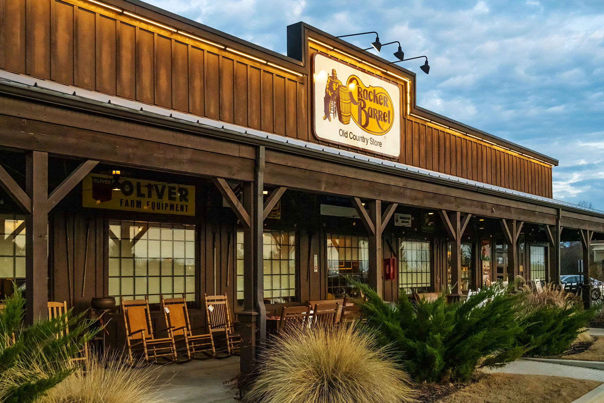

The US restaurant and gift shop chain Cracker Barrel has backtracked out of a planned logo change after widespread criticism of the decision.
So what? It is not the first company to reverse course on a rebrand. If Cracker Barrel had taken note of this ill-fated history, it might have anticipated
•
the financial hit when its stock price sunk after the new logo was launched;
•
the cultural backlash from Conservative influencers and politicians who said the company was “woke” for abandoning parts of its identity; and
•
an intervention from Donald Trump himself who said that “Cracker Barrel should go back to the old logo” and needed to admit its “mistake”.
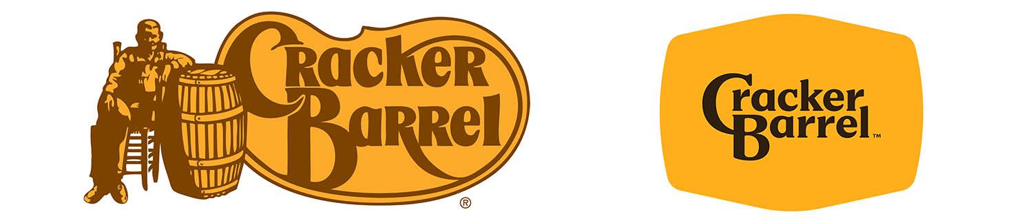
All change. At the time of its initial announcement, Cracker Barrel was already shaking things up. Restaurants were shedding southern US rural interiors in favour of brighter, simpler vibes. A new menu was being rolled out to appeal to younger audiences. But the new text-only logo, which ditched the image of a man in overalls leaning on a barrel, represented a step too far.
The danger. Logo rebrands are risky: physical signage has to be replaced and in the process a brand’s identity can take a hit or disappear altogether. But there’s a reason they happen.
The thinking. In the age of the smartphone, logos are more likely to appear on a digital screen than a billboard. With this extra detail can be lost or appear messy. The path to create a simple and easily adaptable logo is well-trodden. Cracker Barrel wanted to follow in the footsteps of
•
Mozilla Firefox – its globe became a smooth marble, and the fox’s fur was flattened.
•
McDonald’s – kept the golden arches ‘M’ and dropped everything else.
•
Nationwide – swapped its font, ditched some words and went lowercase. Its home and sun logo remained, but used negative space to minimise detail.
Another way. Other brands have re-embraced redesigns of old logos. Pepsi uses a near copy of the logo it had when it was locked in fierce competition with Coca-Cola. Burger King’s logo draws heavily on the one it had during the 1970s “Burger Wars” era. Sports teams such as Stoke and Ajax have returned to legacy designs for new crests to bank on the nostalgia of fans.
What’s surprising is that Cracker Barrel missed the mark when its brand centres on nostalgia.
War on woke. In the pursuit of modernity, Cracker Barrel promoted its redesign as celebrating “the diversity of all our guests with a logo that represented our continued passion for pleasing people of all races, colors, and genders”. This didn’t fly with modern-day conservative America, which has previously taken issue with Bud Light. But such backlashes are not unique to the US.
Bring a horse to water. By underestimating the importance of its identity, Cracker Barrel failed to recognise the stubbornness of its audience, especially in the age of confected culture wars.
Newsletters
Choose the newsletters you want to receive
View more
For information about how The Observer protects your data, read our Privacy Policy
It could have held firm. Pearl Milling Company and Ben’s Original both changed their names and dropped prominent characters (Aunt Jemima and Uncle Ben’s respectively) in their logos during the Black Lives Matter movement. The difference was that these companies were themselves responding to a backlash – in their cases a racial reckoning.
By contrast, Cracker Barrel’s reversal puts it in the same category as
•
Leeds United, which abandoned its new badge in 2018 after fan mutiny;
•
the Sonic The Hedgehog movie, which went back to the drawing board in 2020 after outrage at the design of the titular character in the trailer; and
•
Aberdeen, the UK fund manager, which restored its missing vowels in 2024 after a few years as Abrdn.
What’s more... Cracker Barrel has also deleted pages about diversity and Pride from its website in recent days. It said this was part of a clean-up of outdated content.