
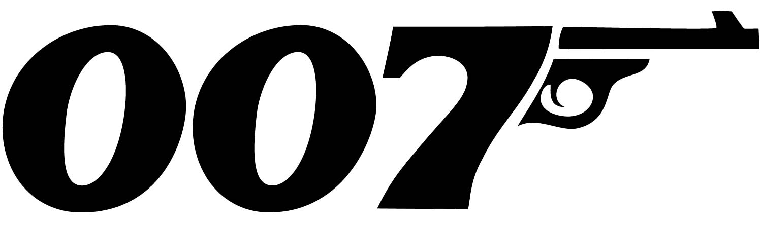
Many reasons have been offered, some quite fanciful, for why Ian Fleming gave his secret agent the number 007. A hotel room, a Kent bus route, an Admiralty filing system and the dialling code for Moscow (which didn’t exist when Casino Royale was written) were all suggested. But one thing seems certain: if Fleming had called James Bond 006, Joe Caroff would have struggled to design as memorable a logo for the film series.
In 1962, David Chasman, marketing executive for United Artists, asked Caroff, a New York graphic designer, to create a publicity letterhead to promote a new thriller, Dr No. As Caroff sketched the numbers 007 against pencil guide lines, he suddenly noticed that the seven resembled the handle of a pistol.
A few refinements later and he had created what would become one of the most recognised emblems in film history. It has appeared on 25 Bond films and been used to sell endless amounts of merchandise. Caroff received $300 for his work and his name has never been in the credits, although the producers did send him an Omega watch, of the kind Daniel Craig’s Bond wears, for his 100th birthday.
Caroff, a modest man who anonymously designed some of the most familiar film posters, was not concerned. “I never made a big thing of it,” he said in a documentary about his career in 2022. “It was a job, I wanted to get it done. I always met my deadlines.” In the design industry, however, his name was respected and, Caroff said, his 007 logo brought a lot of business.
He had impressed people a year earlier with his poster for West Side Story, featuring scuffed black letters on a red background to suggest Manhattan’s brick tenement buildings and angular dancers on fire escapes – though many assumed it was the work of Saul Bass, who designed the film’s titles. Caroff’s love of New York also influenced his design for Manhattan, the 1979 Woody Allen film, in which he replaced the tall letters in the title with silhouettes of familiar skyscrapers.
Caroff was born in Roselle, New Jersey, to Jewish immigrant parents. He was encouraged to paint from the age of four, when given a watercolour set, with which he decorated his white summer suit. At high school, he experimented with modernist techniques and proudly brought home one effort to show his father, Julius, a house painter with a strong work ethic but little artistic imagination. Julius scrutinised his son’s art then scoffed: “Is this the way you paint an apple?”
I only show the client the one that works. I do not allow the client to make choices. That’s my job
I only show the client the one that works. I do not allow the client to make choices. That’s my job
Undeterred, Caroff studied at the Pratt Institute in Brooklyn, then served an apprenticeship under Jean Carlu, a French poster designer, creating propaganda for the war effort. Five days after marrying Phyllis, in 1943, Caroff was drafted into the Eighth Air Force, where he worked in maintenance and painted pin-up girls on B-17 bombers. The Caroffs were married until her death last February; they had two sons and sponsored a foundation for mental health as a result of her career as a professor of social work.
After leaving the army, Caroff worked as a freelance book designer. In 1948, he drew a soldier’s haunted face for the cover of Norman Mailer’s debut novel, The Naked and the Dead. It would be the only work he ever signed, using the name Karov.
After his success with the 007 pistol, he drew lettering for early Bond films and designed the poster for the Beatles film A Hard Day’s Night, showing the band from the nose up and a guitar with a knotted neck. In 1965, he founded an agency, J Caroff Associates, with a team of nine who created posters and lettering for more than 300 films, charging $5,000 for drafts and the same for the finished work. Caroff did not believe in offering studios a range of designs. “I only show the client the one that works,” he said. “I do not allow the client to make choices. That’s my job.”
Newsletters
Choose the newsletters you want to receive
View more
For information about how The Observer protects your data, read our Privacy Policy
Projects from this time include Cabaret and Last Tango in Paris, both from 1972, Rollerball (1975) and A Bridge Too Far (1977). One quality he sought was “effervescence”, saying that he didn’t want his art to “lie there flat”.
Some directors let him get on with it. “I always had the feeling that Woody [Allen] really didn’t want to do advertising,” he said. “He felt that people should just come to his movies.” As well as Manhattan, he designed a poster for Allen’s 1983 film Zelig in which the character’s name appears repeatedly in a variety of fonts.
Others came with ideas and needed talking out of them. Caroff had to explain to Martin Scorsese that he lacked the “visual gift” for promoting The Last Temptation of Christ (1988) and convinced the director to go for a stark black-and-red image based on the tangled crown of thorns. He also designed logos for the broadcasters Fox and ABC and many record covers for Decca.
Interviewed late in life, Caroff said that coming up with ideas was quite easy. “I say the title a few times for 15 minutes and see if it brings up anything,” he said. “If not, it’s just a matter of sitting down and scribbling.”
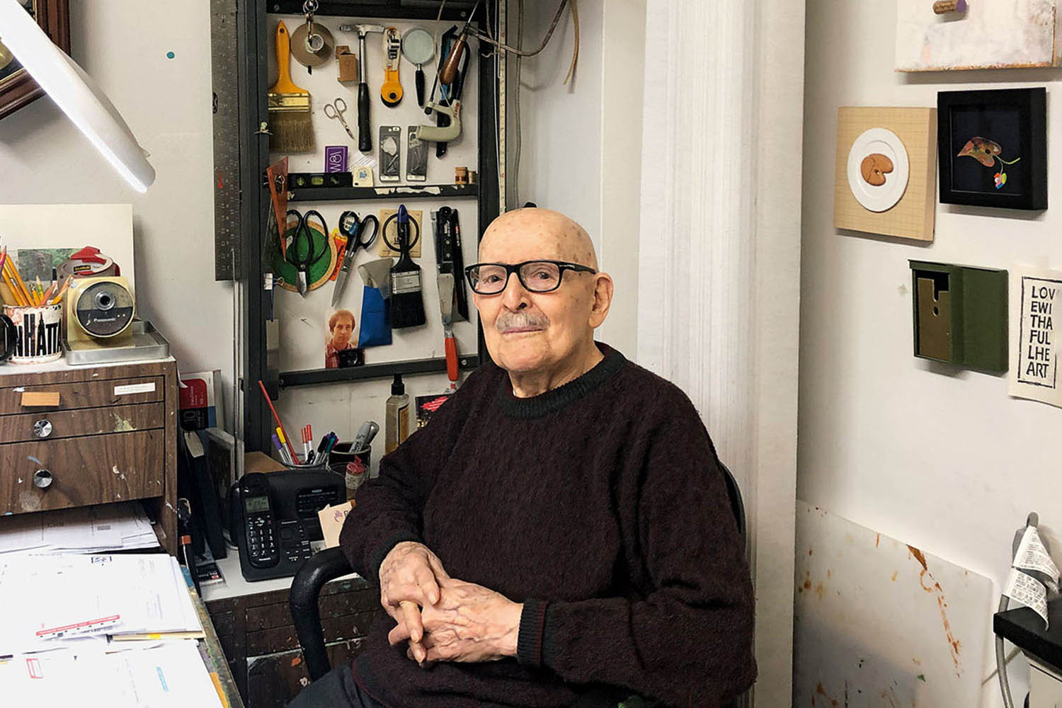
Joseph Caroff, graphic designer, was born on 18 August 1921, and died on 17 August, 2025, aged 103
Photograph by Simone Bloch