
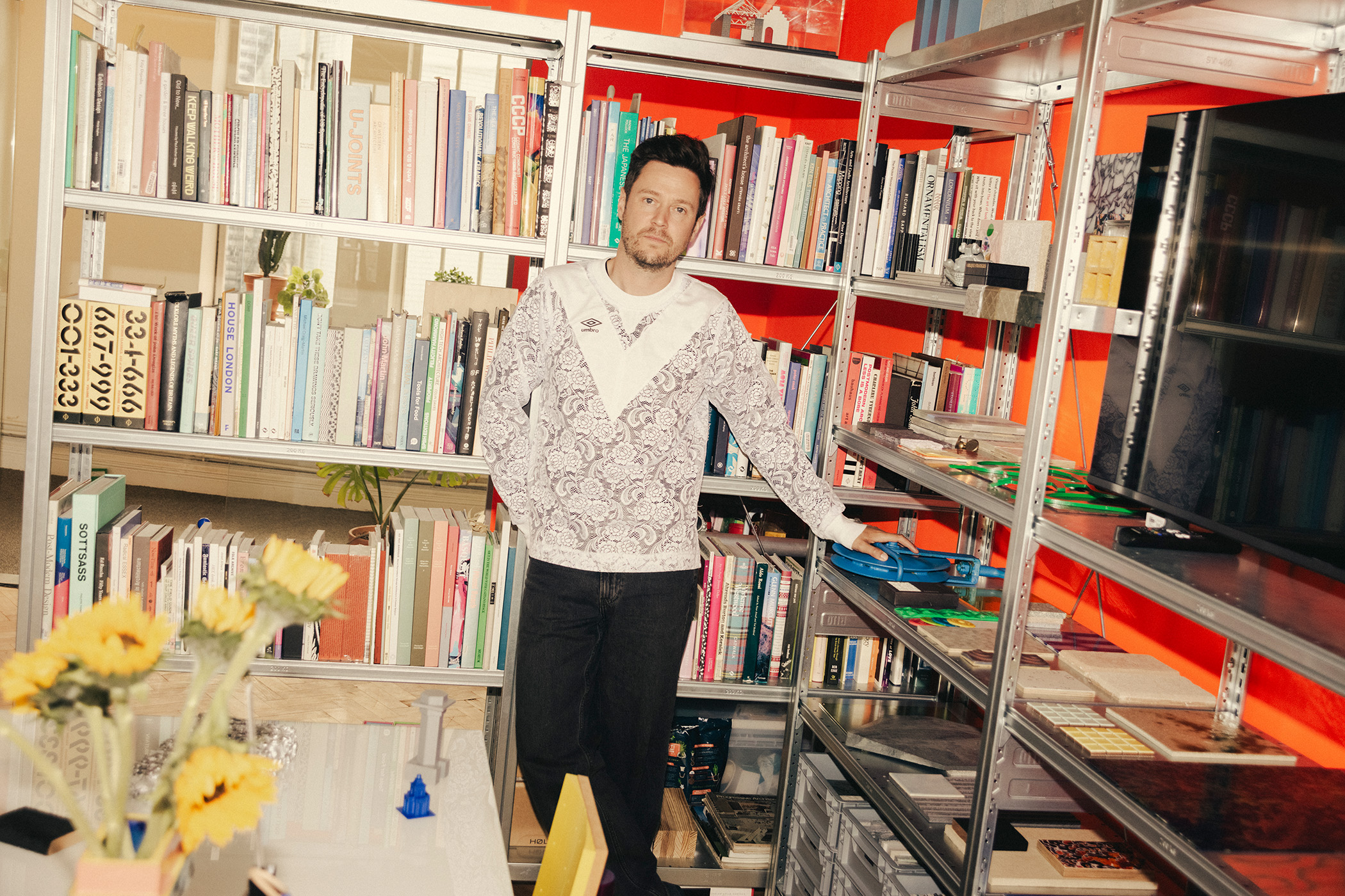
Architects’ homes tend to be grand spaces – in our imaginations at least. We picture immaculate testbeds of theory, manifestos in bricks and mortar. But the reality for most architects is rather different. When William Guthrie set out to make a home for his growing family, he faced challenges familiar to the rest of us. The way he solved them amounts to a kind of manifesto, but without any of the grandiosity you might expect from such a term.
His apartment in Brockley, south London, occupies a section of an 1870s house now carved into five flats. When Guthrie first saw it, the place was full of the perfunctory fixes described on social media as “landlord specials”. Odd design decisions spoke of carelessness, partitions made the flat feel cramped. In the bathroom, the home’s impressively high 3.2m ceiling had been lowered, leaving a useless void above. Walls were drowned in what Guthrie calls “yucky magnolia” and woodchip-textured wallpaper. “It was really neglected, but it just had something about it,” he says.
Guthrie planned to knock through the warren-like layout, sketching a huge, light-filled living-and-dining space with bedrooms leading from it. But then came the obstacles. A solicitor uncovered a restrictive covenant forbidding structural alterations, a neighbour objected to the removal of a load-bearing wall. Budgets were tight. His wife, Valeria Mariani, an arts producer, was struggling with temporary accommodation while taking care of their toddler.
A more bullish architect might have forced the issue. Instead, Guthrie rethought the project from scratch. “It forced me to be inventive with what we already had,” he says. “These legal, spatial, structural sorts of constraints were actually very productive.” Back at the drawing board, he devised a scheme that was, as he puts it, “technically simple but spatially consequential.”
One word comes up again and again as we speak: generosity. “I think it’s reductive to use floor space as a metric of generosity,” he tells me. “The quality of space, the proportions and relationships of rooms, are much more important than size alone.”
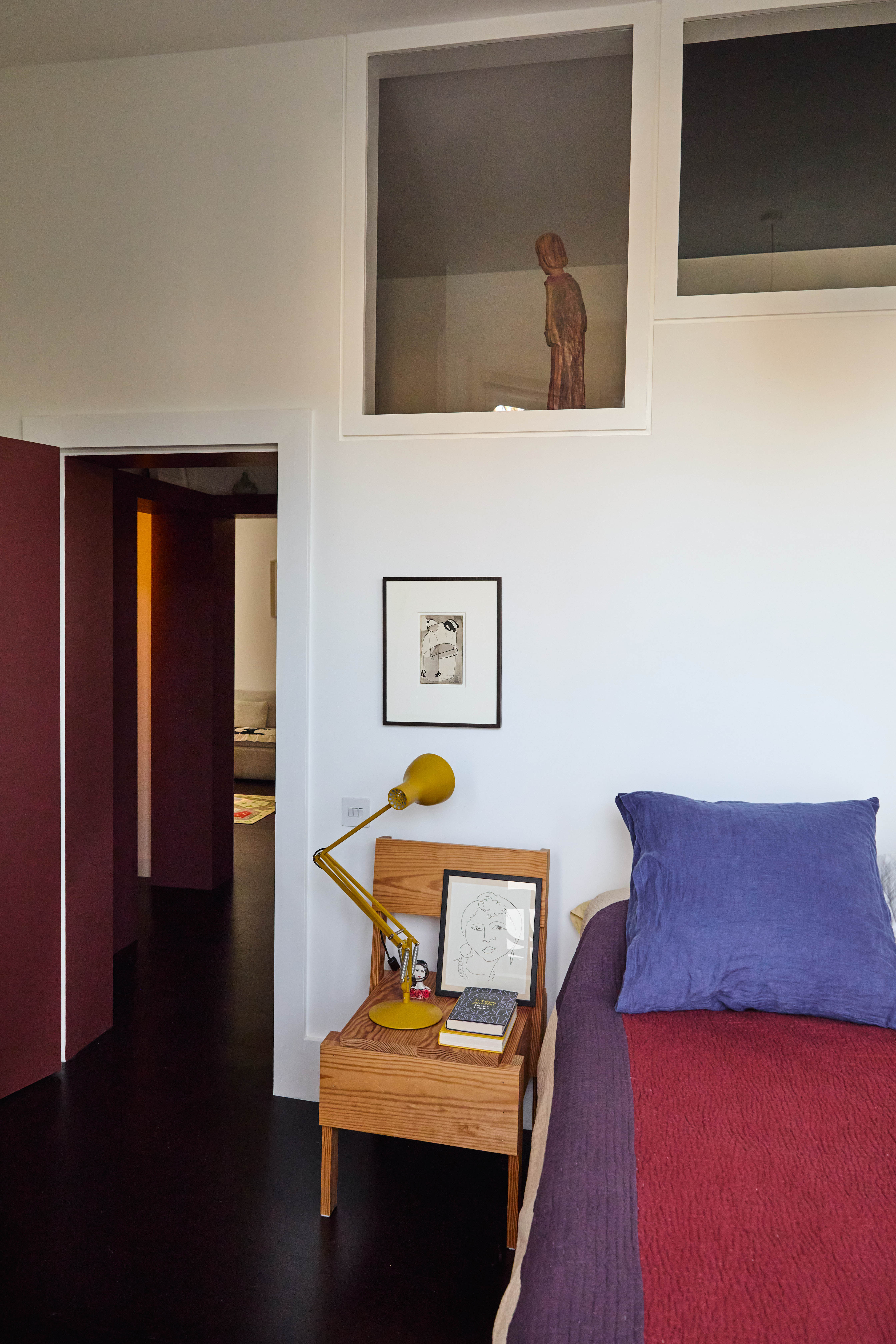
Red alert: a view from the bedroom
His interventions throughout the fairly compact flat were governed by that philosophy – something of a change in scale for Guthrie, who has lately been busy on proposals for art museums in Norway and Switzerland.
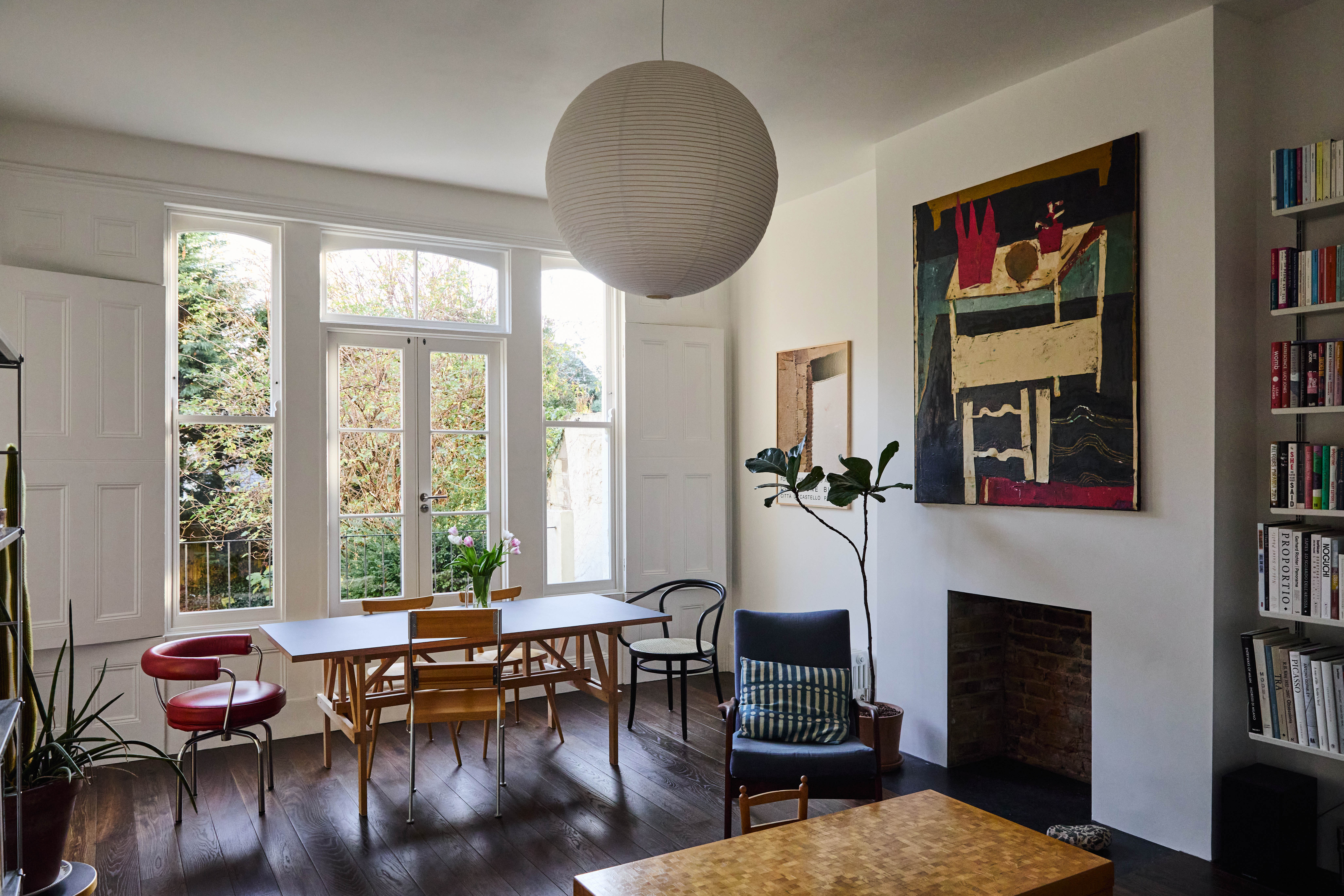
The most transformative change sits just inside the front door, beyond a small vestibule. A broadened, reproportioned hallway has been painted in a rich shade he describes as “kidney-bean red”. Once a mean corridor, this space is now at the heart of the flat. “I hesitate to call it a hallway, as it has the dignity of a room,” he says. “One of our friends calls this space the womb.” Other rooms radiate from it. Painting the internal doors means that when they stand open, this red core spills into the rest of the flat.
Above lintel-height, the walls in the hallway return to white, punctuated by clerestory windows that borrow light from adjoining spaces. The high sills display a rotating cast of treasures: pottery by Guthrie’s sister, Cara Guthrie, and by artist Aaron Angell; paintings by Igor Moritz and David Abbott; the odd plastic dinosaur belonging to their son. “I really love it,” says Mariani, smiling. How many of us can say the same of our hallways?
The bedrooms, living room and kitchen are white-walled, but jolts of colour enliven each space. A basic Ikea cupboard looks like nothing so ordinary, thanks to zingy lime-green handles by designer-maker James Shaw, two dollops of recycled plastic squeezed as if from a toothpaste tube.
At the dining table, a tomato-soup-red leather chair sits beside their son’s matching Stokke Tripp Trapp high chair. The red, black, white and green of the Palestinian flag appears here and there. Mariani, who has close ties to the Middle East, has dotted flag stickers around the flat.
Newsletters
Choose the newsletters you want to receive
View more
For information about how The Observer protects your data, read our Privacy Policy
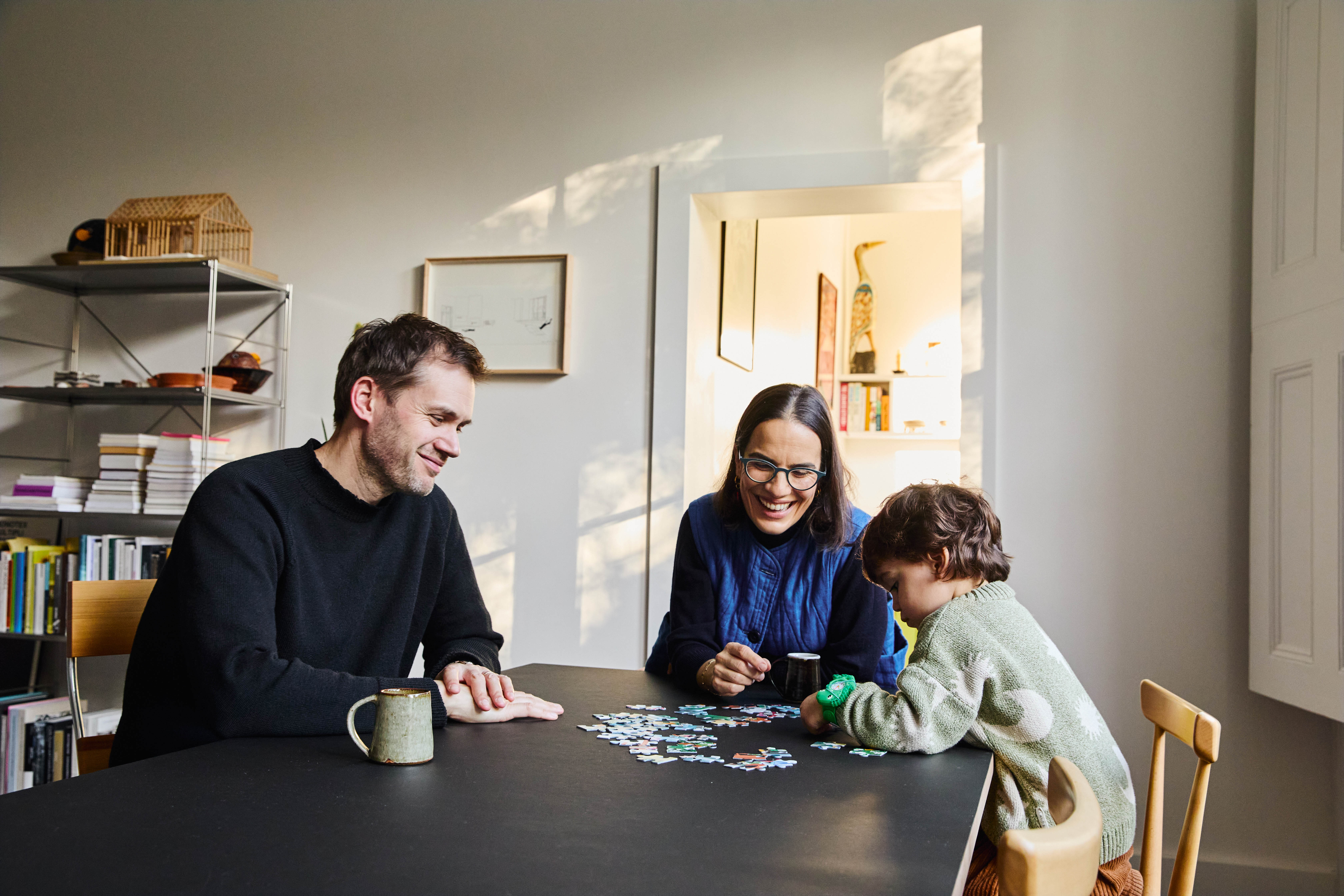
Family time: William Guthrie and his wife, Valeria Mariani, and their son
Part of what first sold the couple on the flat was its central room: a high-ceilinged space with French windows opening on to a balcony over the shared garden. “It has something of the feel of a portego, that grand central hall in a palazzo,” Guthrie says, comparing the relationship between balcony and garden to that between balcony and Venetian canal. The couple know Venice well – Mariani is Italian and often works on the Venice Biennale as a consultant.
Changes to this central space were mostly cosmetic. The previous landlord had installed a strangely bulky marble fireplace, which Guthrie stripped back to its brick firebox before adding a simple limestone hearth. “Small things like reducing the volumetric presence of something so ostentatious can make everything else feel a bit more generous,” he says.
A dark, dingy bathroom was more of a puzzle. “A bathroom with absolutely no light is a bit bleak,” he says. To remedy this, he brought in “borrowed light” through another clerestory window from the main bedroom – a nod to midcentury Milanese flats designed by Luigi Caccia Dominioni, one of Guthrie’s key architectural references.
Removing the false ceiling restored the room’s full height, but that created a new challenge. “There’s something slightly unnerving, I find, about a space in which the height of the room far exceeds the width and the floor dimensions,” he says. To counteract this effect, he painted the ceiling with a deep blue gloss.
The room now feels more comfortably contained. This trick was inspired by a hallway in Villa Müller in Prague, designed by the modernist architect Adolf Loos in 1930. Perhaps unsurprisingly for a lecturer – Guthrie teaches architecture at Kingston University – the apartment is full of erudite touches that he describes as “loose translations of ideas”.
Several pieces of furniture were made by Guthrie himself using designer Enzo Mari’s classic DIY manual Autoprogettazione? In the kitchen, striking sulphur-yellow cabinetry runs through like a bright seam, inspired by a talk he once heard by the artist Thomas Demand. “Someone in the audience asked, ‘What’s your favourite colour?’ Demand rolled his eyes at the question but said, quick as a flash, ‘Sulphur.’ I was just like, yeah – that is a very good colour.”
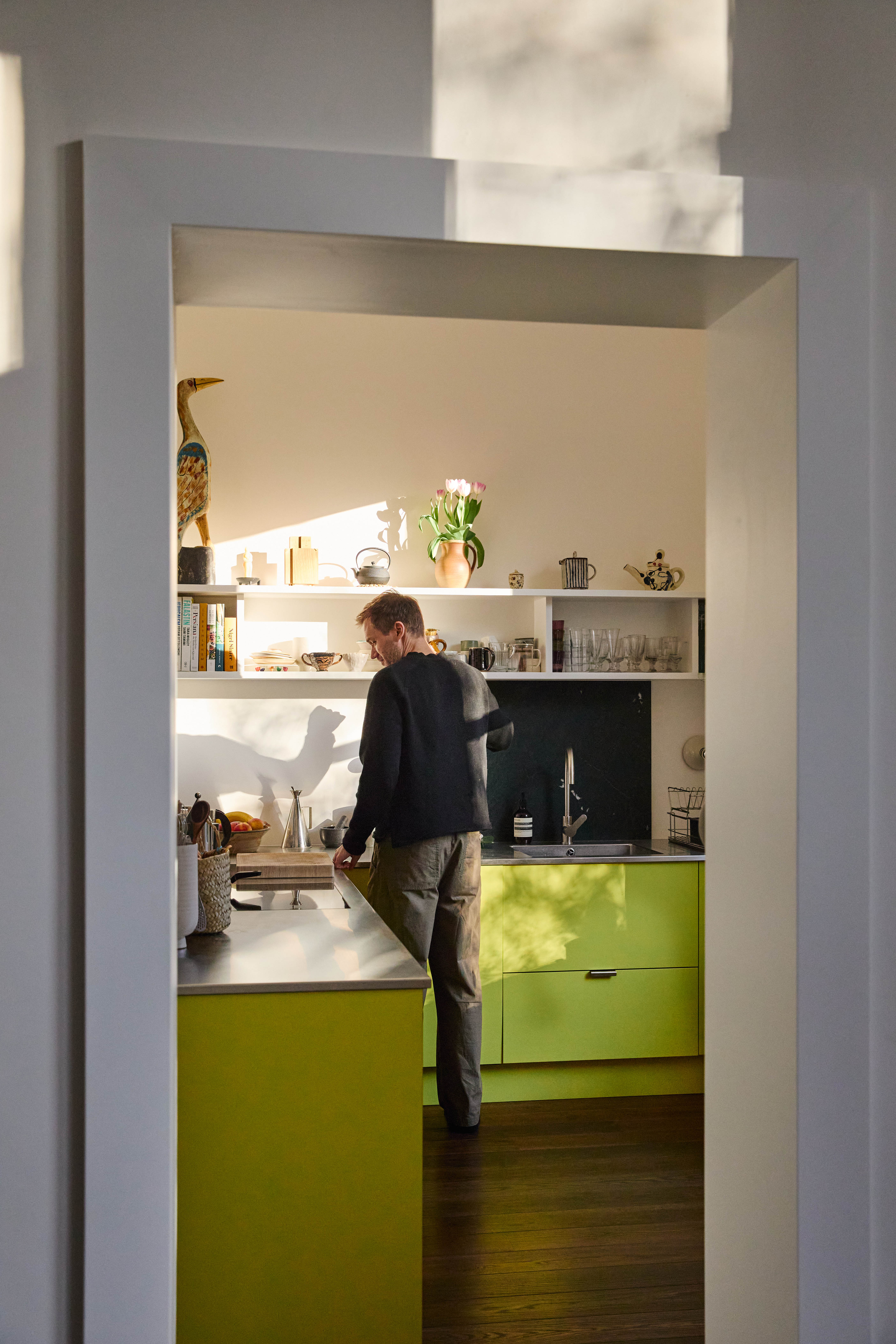
What's cooking? The cabinets in the kitchen are 'sulphur yellow'
Guthrie quotes the Viennese architect Hermann Czech, who coined the phrase “architecture as background”. The idea is clearly a lodestar for him. “I’m not interested in an architecture of style,” he says. “It’s more about establishing a framework for existence.”
He contrasts this with what he calls “intolerant architecture”: buildings so governed by the architect’s ego that they make life harder for their occupants. He cites Peter Eisenman’s notorious House VI from 1975 – in which, he says, the architect “made a couple sleep in separate beds because he felt it was important to have a window between them” – as the extreme end of the spectrum.
“It would have been disrespectful not to involve my partner in design decisions – and even our child. This home is for all of us.”
Their son, now three, has strong feelings about space. “He’s always closing doors and talking about shadow or dark,” Guthrie says, amused. “He likes containment.” As an architect, he finds that instinct interesting: the dance between openness and enclosure, between what adults assume a child needs and what a child actually finds comforting.
“Ultimately, it’s all about making spaces conducive to happy living,” Guthrie says simply. On that measure, this London flat succeeds with gentle conviction – acting, in its own quiet way, as a manifesto.