

The graphic designer Paula Scher is famous for many things: designing the rock band Boston’s first album cover, with UFOs that morph into guitars when you turn the record sleeve upside down; becoming the first female partner, in 1991, of the international design consultancy Pentagram, where she still works; shaping the visual identities of some of New York City’s most celebrated cultural institutions – the Metropolitan Opera, the Public Theater, the New York City Ballet, the High Line – so that today it is almost impossible to take a step without bumping into her perennially lively graphics. Not least, Scher, 78, is famous for hating the typeface Helvetica, which is kind of like hating chicken. Most people find the well-made, no-fuss, goes-with-anything sans-serif font inoffensive if not positively endearing.
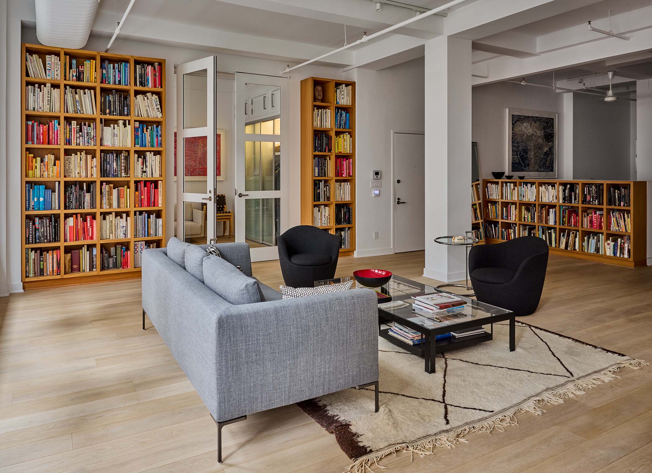
Which is why a recent visitor to her home in Manhattan’s NoMad (north of Madison Square Park) neighbourhood was surprised to see it furnished with well-made, no-fuss, goes-with-anything pieces, such as Alvar Aalto’s 611 dining chairs and Eileen Gray’s chrome-and-glass adjustable end tables. The walls and ceiling were white, the sofa was taupe, the living room rug was Moroccan (a favourite among giants of the International Style).
“Please don’t take this the wrong way,” the visitor said, “but isn’t this Helvetica decor?” Scher, who recently designed the logo for a new Chinese car that can scale mountains and swim in bodies of water, laughed. She liked the form of Helvetica just fine, she said. But working in the 1970s music industry, she had rebelled against the neutrality that was demanded of so-called serious designers, and preferred quirky typefaces that expressed ideas more feelingly. And then there was the problem of execution: “If people used Helvetica and they didn’t space it right, it was really awful,” she said. She was dressed in black slacks and a black-and-white striped shirt that wasn’t quite op art, but not far from it. Rings intended for fingers were strung on a chain around her neck.
“I don’t think it has to do with modern,” she added about her domestic style. “It has to do with simple. I don’t want the furniture to force me to do something we don’t want to do with the art.”
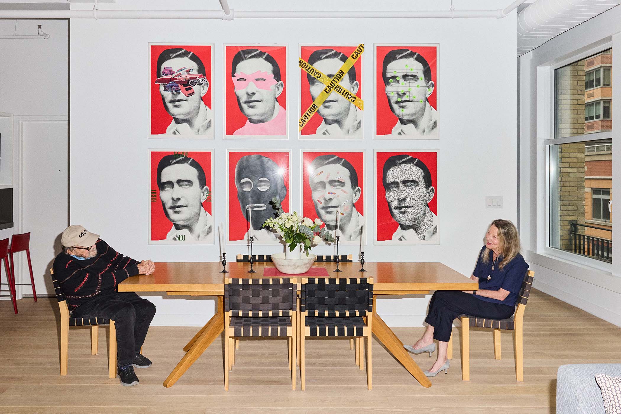
The walls are what really count in this 176.5 sq-metre condominium loft in a 19th-century former furrier’s building. Much of what hangs on them is by Scher or her husband, the graphic designer and illustrator Seymour Chwast. A co-founder of Push Pin Studios, a consultancy that introduced pop art to the postwar mainstream in head-spinning ways. It’s probably best remembered for the rainbow-haired profile of Bob Dylan drawn by another cofounder, Milton Glaser.
Jeremy Liebman
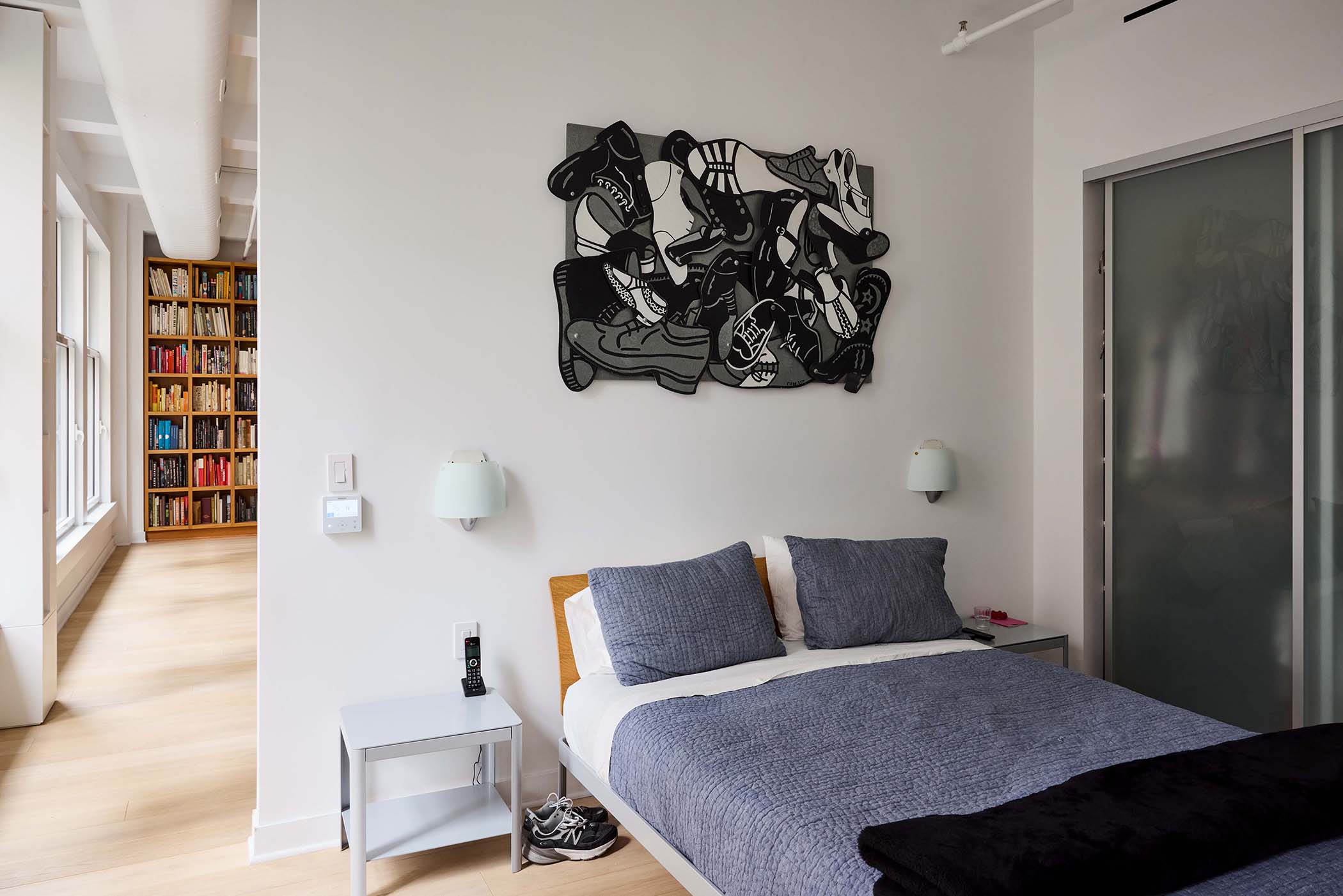
Chwast, 94, is represented in the living room by a grid of eight collaged, poster-like artworks inspired by that 1950s advertising stalwart the Brylcreem Man. (There are 45 others in the series, but no more could fit on the wall.) His sheet-metal cutout of a heap of shoes, which pays tribute to his wife’s untidy closet, hangs over the couple’s bed. A Push Pin exhibition poster of a comb with broken teeth, called Unbreakable, whose clone can be found in the Museum of Modern Art’s permanent collection, rests on the top of a cabinet in his office at the loft’s entrance. (Scher’s home studio is off the living room. Both work areas are generously sized, as if to declare that life and labour are inseparable for these people.)
Scher’s designs are also at MoMA: dozens of pieces, including a poster for the 1995 Public Theater production of Him, a play written and performed by Christopher Walken about Elvis Presley in purgatory. In that poster, the silhouette of a black pompadour floats on an acid green background, and the main text is neon pink. But what’s displayed in Scher’s home are large, frenetically detailed maps that she has been painting since 1999, a side hustle she cultivated while redesigning the financial giant Citibank’s brand identity. Because of that hyper-corporate project, which involved endless meetings, she said: “I felt like my hands were being cut off, you know? I felt like I wasn’t making anything.” Her latest exhibition was in April at Jim Kempner Fine Art, in Manhattan.
Apart from functional objects, such as the jeweller Ted Muehling’s knobby candlesticks on the Matthew Hilton-designed Case dining table, the loft has few gewgaws; exceptions are vintage French bowling pins with painted faces that line up in the kitchen, and a Panda Poo-Poo fragrance dispenser, a gift from China, in the primary bathroom. “Artefacts are not a big part of our lives,” Scher told New York Magazine several years ago. “We used to have lots of knick-knacks – antique toys and things designers always have – but I decided it was really creepy and got rid of them.”
Jeremy Liebman
She and Chwast moved to the building in 2005, after fighting a bruising real-estate battle to remain in their below-market-rate rental near Gramercy Park. (They won the court case but lost the will to put up with the hectoring landlady, who was intent on exploiting soaring property values.) Their new quarter had the distinction, rare in Manhattan, of having no name. Scher recalled that when they arrived, it was populated by vendors selling knockoff Gucci handbags, and was occasionally rattled with gunfire. Now it hosts nice restaurants and a cluster of furniture showrooms. “In New York City, if you stay someplace long enough, it becomes a great neighbourhood,” Scher said. The loft has been tweaked a few times over the decades to fulfil non-furrier needs. The damaged floors were replaced with raw oak boards. Space was carved from the primary bedroom and handed to the en-suite bathroom to create a larger, more sybaritic retreat where even the shelving is tiled so that water can splash anywhere. A row of four-foot-wide sash windows in the living room was swapped out for casement windows that easily swing open to allow Scher to tend flower boxes. The many books displayed are organised not by title or subject but by colour.
“Paula has always been a neutralist,” said Steven Heller, a design historian and educator who is a longtime friend of the couple, referring to the ease with which she adapts to her various environments. “When she and Seymour had an Arts and Crafts home in Connecticut, there was plenty of dark wood and craftsman furniture. But when she refurbished her loft, it was airy and modern, while retaining its functionality.” The couple are not “design ideologues,” he added. “They live in the most comfortable, efficient manner possible.”
Newsletters
Choose the newsletters you want to receive
View more
For information about how The Observer protects your data, read our Privacy Policy
Jeremy Liebman