
Camber Sands, on the East Sussex coast, is a place in motion. It is a creation of sand, wind and tides, its dunes continually shifting, the territory of its huge beach expanding and contracting about twice daily with the movement of the moon, the horizon the main constant. It is also beautiful.
Its buildings look provisional, improvised and unofficial, typically made of timber frames and boarding, not wanting to bet too much on the stability of the ground. Its population is in flux, too. About 1,100 people live there year-round, but 20 or more times that number will visit on a good summer’s day, generating hours-long queues of traffic and bringing pressure that its modest facilities can barely stand.
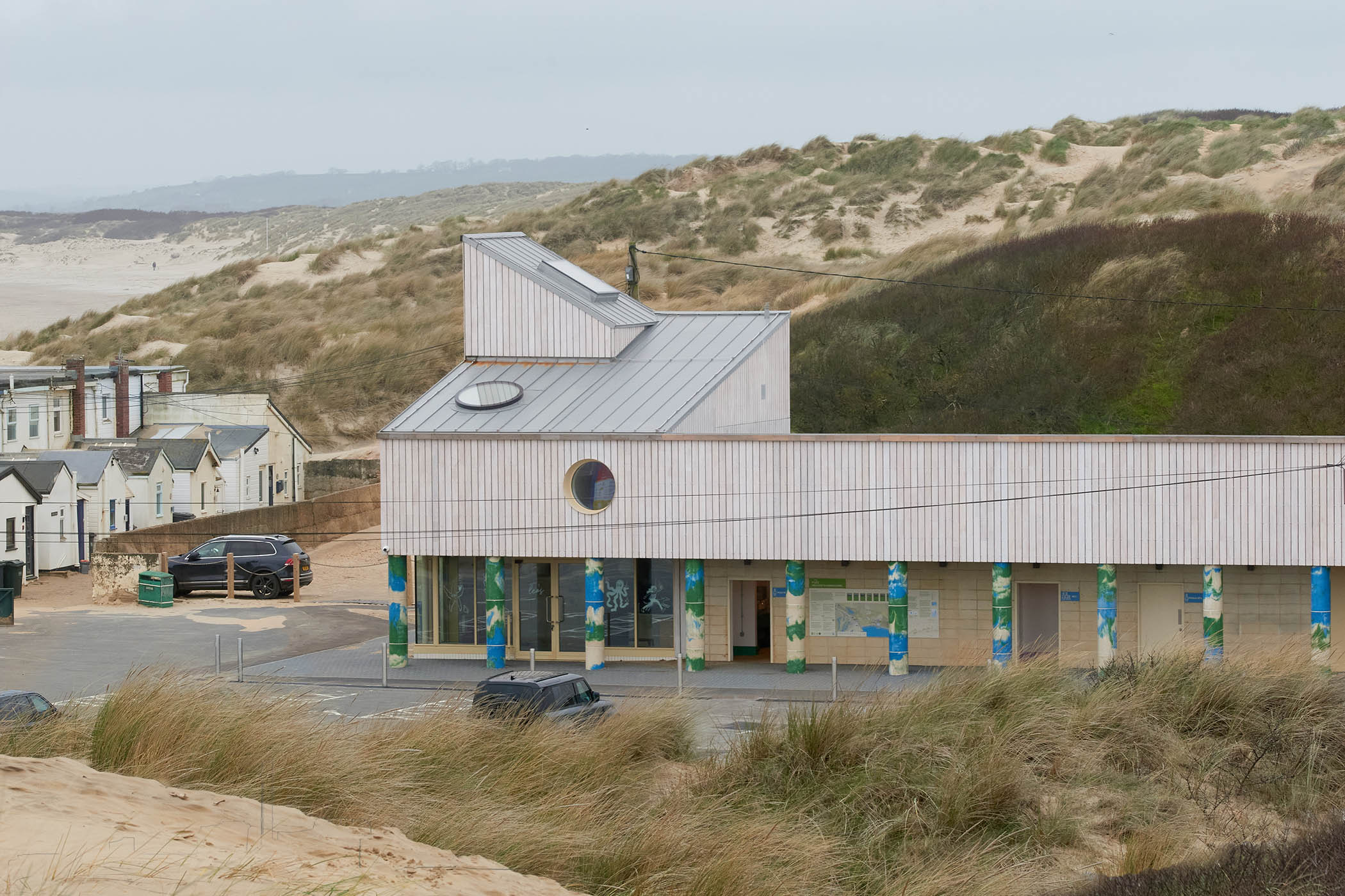
A long bar of building, roughly at rightangles to the sea, has now been inserted into this fluid landscape. This is the Welcome Centre, which has a cafe, rooms and storage space for lifeguards, the RNLI and the local authority team that manage the beach. Out of season these rooms can serve as places of meeting and learning for the local community. The building also, importantly, provides a large number of public toilets.
Its uses include dealing with medical emergencies, keeping quad bikes and responding to the unexpected. It recently helped to store the millions of plastic pellets, probably spilled by Southern Water, that were cleaned up by volunteers. It is also a place where children can learn about the unique local ecology and the dangers to it. So the building is both functional and civic, a bit of a shed and a bit of a town hall.
It is designed by the architects DK-CM, whose previous work includes the civilising of the hard concrete spaces under the Westway flyover in west London. As in much of their work, they developed their ideas for Camber in consultation with users and local people. They found some resistance to the idea that this new publicly funded building should be oriented too much to the tourist hordes, rather than people who lived nearby.
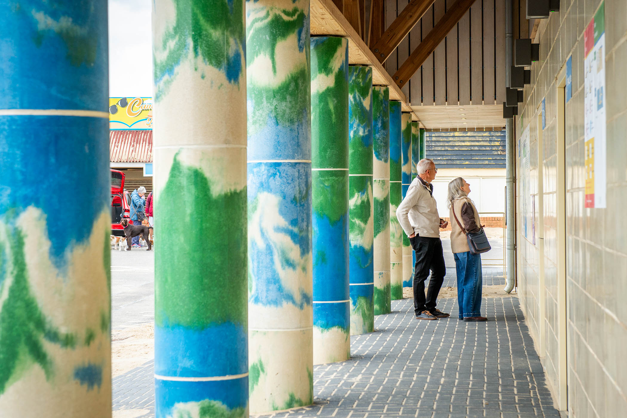
Pillars are dyed with blue-green-cream swirls inspired by the garish colours of ice-creams
Its design fuses the lean-to informality of local structures with more orderly and solid construction. It also had to be robust enough to withstand harsh weather and high winds, and to cope with the relentless flows of sand that push into every crevice. And, as with all public buildings by right-thinking architects, the design had to be in some sense sustainable.
It presents a colonnade of 13 concrete pillars to its neighbouring car park, which would be almost solemn if they weren’t dyed with blue-green-cream swirls inspired, say the architects, by the garish colours of seaside ice-creams. They could also represent, if you like, those of the sea, the countryside and the sand. Above is a long, high entablature in sweet chestnut boarding – a material chosen for its durability as well as its appearance – level as the horizon. At one end a roof starts folding upwards, then another one out of that, to form a sort of tower. Two circles, a window and a rooflight puncture the surfaces.
The colonnade might be a good place to shelter in the rain. Behind it is the cafe and all-important toilets, in a structure retained for ecological reasons from two blocks that were already there, with a new roof oversailing the whole ensemble. The short ends of the block respond to their situations: the one facing the sea rises up into a collage of tower and gable; the other slopes modestly downwards to a cluster of houses and shops. At night the building shines like a lantern, with lines of light glowing between the boards.
The colonnade and tower nod to a tradition of public buildings that goes back to town halls in medieval Flanders and Renaissance Italy, a conceit which, if it sounds highfalutin for a site next to a car park, is brought back to Earth by the plainness of the construction. The building is both 3D and 2D, mini-monument and billboard. In this combination of high and low art it owes an acknowledged debt to the Philadelphia postmodernists Robert Venturi and Denise Scott Brown, in particular a perky fire station they designed in Columbus, Indiana, that has a cult following among many architects.
There are a few signs of budget pain: a tidal clock proposed for the sea-facing facade, for example, is yet to be installed. But DK-CM, their clients Rother District Council and the project’s collaborators and contractors have together created a building at ease with the dunes and shacks around it, the leaning telegraph poles and garish signs, while also bringing a moment of distinction to its surroundings. The British seaside is rich in singular, hard-to-categorise, quietly delightful buildings. This is a nice addition to the genre.
Newsletters
Choose the newsletters you want to receive
View more
For information about how The Observer protects your data, read our Privacy Policy
Photographs by DK-CM